HealthTrak: Making Digital Health Accessible for Seniors
As digital health technologies become increasingly prevalent, many older adults find themselves excluded due to complex interfaces and accessibility barriers. HealthTrak was developed to address this gap by creating an intuitive, voice-enabled health management app specifically designed for users aged 50-75.

UI/UX Designer
Healthcare
August 2024
Challenge
Despite growing smartphone adoption among seniors (68% of Boomers own smartphones), digital health apps often present significant barriers:
Complex interfaces that frustrate older users
Small text and poor contrast affecting readability
Lack of consideration for physical and cognitive limitations
Privacy and security concerns
Need for simplified medication and health tracking
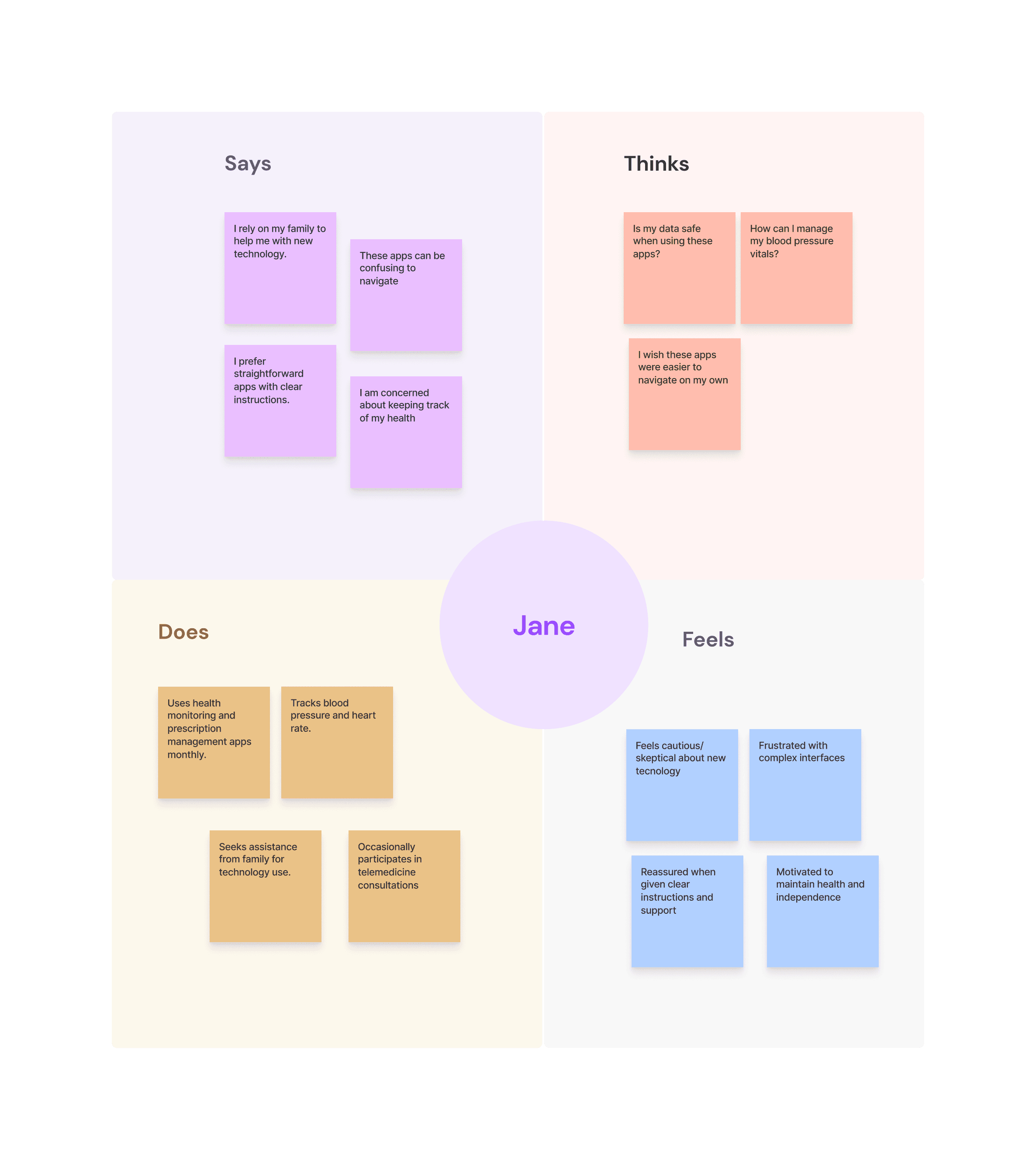
Research
I conducted a focused survey with 9 individuals aged 50-75 to understand their experiences with digital health applications. Key insights revealed:
Variable comfort levels with digital health tools
Strong interest in telemedicine capabilities
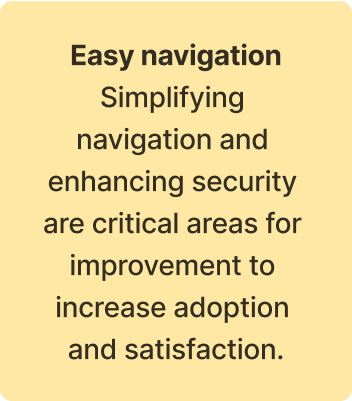
Need for simplified navigation and enhanced security
Positive reception to voice assistance features
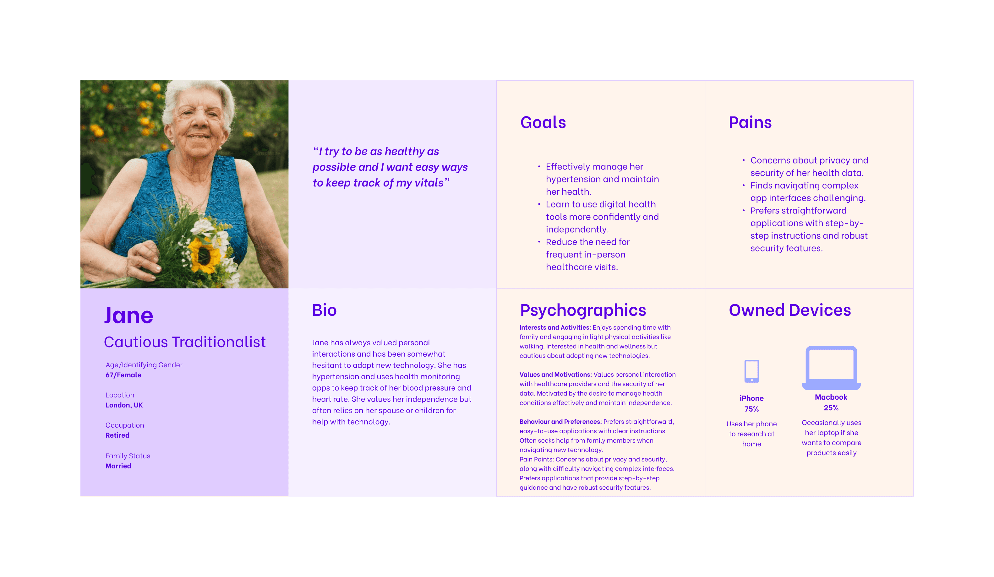
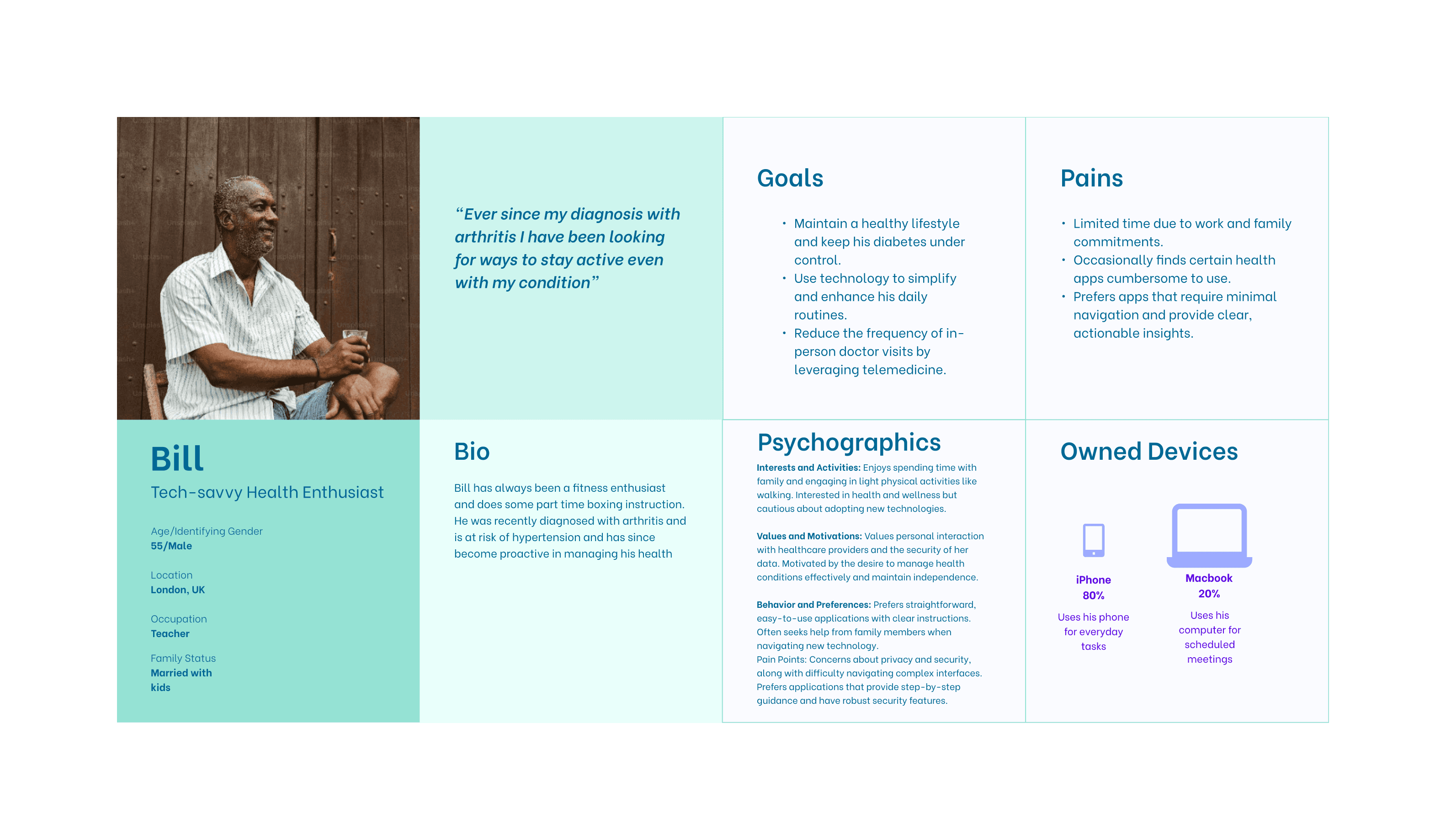
User Personas
I developed detailed personas to guide the design process:
Jane, 67: Lives independently but manages multiple medications
Bill, 55: Tech-curious with some physical limitations

Design Process
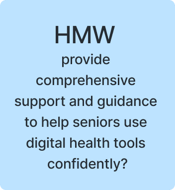
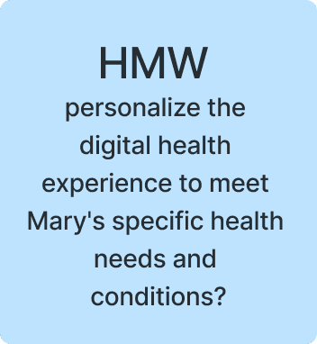
Using the How Might We (HMW) framework, I identified key opportunities:
Voice-assisted interface for hands-free operation
Simplified navigation with clear hierarchies
Large, high-contrast text and buttons
Comprehensive but straightforward health tracking
Easy medication management system
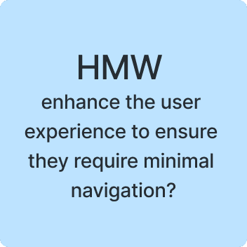

Opportunity areas


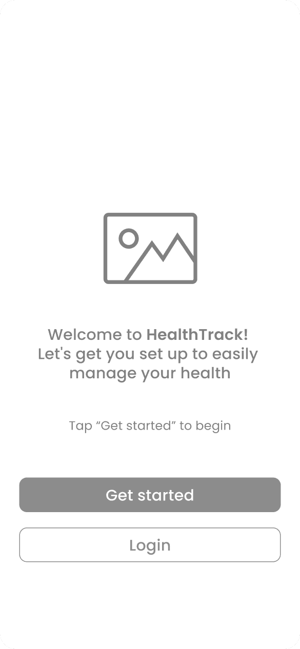
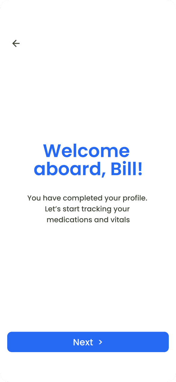
Onboarding screens
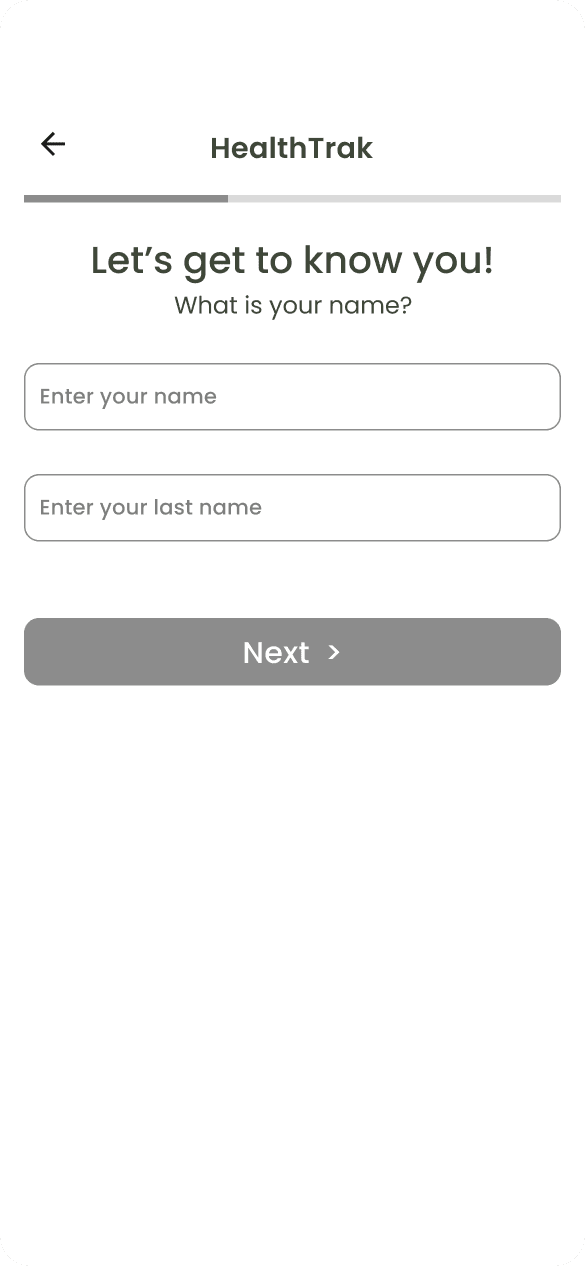
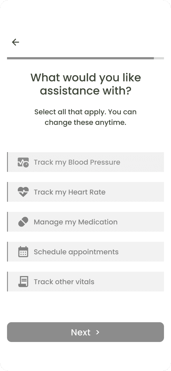
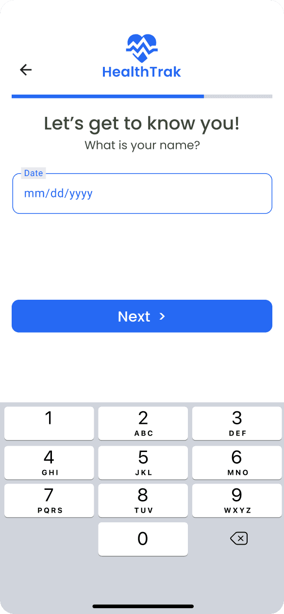
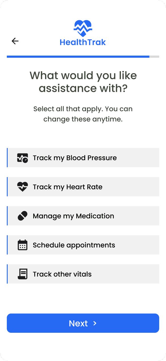
The onboarding process features a user-friendly design prioritizing simplicity and accessibility. We've implemented larger font sizes throughout and minimized required signup information. Content is thoughtfully distributed across three separate screens to prevent overwhelming users with too much information at once.


Home Screens
The interface was designed with accessibility at its core, featuring clean, uncluttered layouts that maintain a clear visual hierarchy throughout the experience. Users benefit from large touch targets that improve interaction accuracy, while voice command functionality for key functions enhances hands-free usability. For more complex operations, the system provides intuitive step-by-step guidance to ensure all users can navigate processes successfully regardless of their technical proficiency.


Impact & Learnings
Key Outcomes
Created an accessible digital health solution for seniors
Successfully integrated voice assistance for key tasks
Developed a user interface that accommodates various physical limitations
Lessons Learned
Simplicity is crucial but shouldn't mean limiting functionality
Voice interfaces can significantly improve accessibility
Clear feedback and confirmation are essential for building trust
Next Steps
Expand voice command capabilities
Add telemedicine integration
Develop family member monitoring features
Implement emergency alert system